calour.heatmap.heatmap

calour.heatmap.heatmap(exp: calour.experiment.Experiment, sample_field=None, feature_field=None, xticklabel_kwargs=None, yticklabel_kwargs=None, xticklabel_len=16, yticklabel_len=16, xticks_max=10, yticks_max=30, clim=(None, None), cmap='viridis', norm=<matplotlib.colors.LogNorm object>, title=None, rect=None, cax=None, ax=None)[source]

Plot a heatmap for the experiment.

Plot either a simple heatmap for the experiment with features in row and samples in column.

Note

By default it log transforms the abundance values and then plot heatmap. The original object is not modified.

Note

This function is also available as a class method Experiment.heatmap()

Parameters:
  • exp (Experiment) – Input experiment object.
  • sample_field (str or None, optional) – The field of sample metadata to display on the x-axis or None (default) to not show x axis.
  • feature_field (str or None (optional)) – The field of feature meadata to display on the y-axis. None (default) to not show y axis.
  • xticklabel_kwargs
  • yticklabel_kwargs (dict or None, optional) – keyword arguments passing as properties to matplotlib.text.Text for tick labels on x axis and y axis. As an example, xticklabel_kwargs={'color': 'r', 'ha': 'center', 'rotation': 90, 'family': 'serif', 'size'=7}
  • xticklabel_len (int or None) –
  • yticklabel_len (int or None) – The maximal length for the tick labels on x axis and y axis (will be cut to this length if longer). Used to prevent long labels from taking too much space. None indicates no shortening
  • xticks_max (int or None) –
  • yticks_max (int or None) – max number of ticks to render on the heatmap. If None, allow all ticks for each sample (xticks_max) or feature (yticks_max) in the table, which can be very slow if there are a large number of samples or features.
  • clim (tuple of (float, float), optional) – the min and max values for the heatmap color limits. It uses the min and max values in the input Experiment.data array by default.
  • cmap (str or matplotlib.colors.ListedColormap) – str to indicate the colormap name. Default is “viridis” colormap. For all available colormaps in matplotlib: https://matplotlib.org/users/colormaps.html
  • norm (matplotlib.colors.Normalize or None) – passed to norm parameter of matplotlib.pyplot.imshow. Default is log scale.
  • title (None or str, optional) – None (default) to not show title. str to set title to str.
  • rect (tuple of (int, int, int, int) or None, optional) – None (default) to set initial zoom window to the whole experiment. [x_min, x_max, y_min, y_max] to set initial zoom window
  • cax (matplotlib.axes.Axes, optional) – The axes where a legend colorbar for the heatmap is plotted.
  • ax (matplotlib.axes.Axes or None (default), optional) – The axes where the heatmap is plotted. None (default) to create a new figure and axes to plot the heatmap
Returns:

The axes for the heatmap

Return type:

matplotlib.axes.Axes

Examples

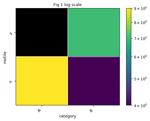
Let’s create a very simple data set:

>>> from calour import Experiment
>>> import matplotlib as mpl
>>> import pandas as pd
>>> from matplotlib import pyplot as plt
>>> exp = Experiment(np.array([[0,9], [7, 4]]), sparse=False,
...                  sample_metadata=pd.DataFrame({'category': ['A', 'B'],
...                                                'ph': [6.6, 7.7]},
...                                               index=['s1', 's2']),
...                  feature_metadata=pd.DataFrame({'motile': ['y', 'n']}, index=['otu1', 'otu2']))

Let’s then plot the heatmap:

>>> fig, ax = plt.subplots()
>>> exp.heatmap(sample_field='category', feature_field='motile', title='Fig 1 log scale', ax=ax)   

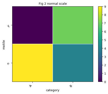
By default, the color is plot in log scale. Let’s say we would like to plot heatmap in normal scale instead of log scale:

>>> fig, ax = plt.subplots()
>>> norm = mpl.colors.Normalize()
>>> exp.heatmap(sample_field='category', feature_field='motile', title='Fig 2 normal scale',
...             norm=norm, ax=ax)             

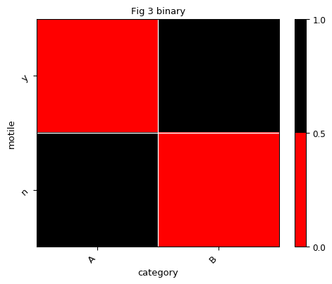
Let’s say we would like to show the presence/absence of each OTUs across samples in heatmap. And we define presence as abundance larger than 4:

>>> expbin = exp.binarize(4)
>>> expbin.data
array([[0, 1],
       [1, 0]])

Now we have converted the abundance table to the binary table. Let’s define a binary color map and use it to plot the heatmap:

>>> # define the colors
>>> cmap = mpl.colors.ListedColormap(['r', 'k'])
>>> # create a normalize object the describes the limits of each color
>>> norm = mpl.colors.BoundaryNorm([0., 0.5, 1.], cmap.N)
>>> fig, ax = plt.subplots()
>>> expbin.heatmap(sample_field='category', feature_field='motile', title='Fig 3 binary',
...                cmap=cmap, norm=norm, ax=ax)         

(Source code)

../_images/calour-heatmap-heatmap-1_00.png

(png)

../_images/calour-heatmap-heatmap-1_01.png

(png)

../_images/calour-heatmap-heatmap-1_02.png

(png)