
Creating an animation using Emperor
In this tutorial we describe how to create a principal coordinates analysis (PCoA) plot, and display animated traces of the samples sorted by a metadata category. For this purpose, we will describe a Synthetic Example (explaining concepts) and a Real Example (that deals with the actual plot generation, and curation).
To do this, we need to have two metadata categories, a gradient category, and a trajectory category. The gradient category determines the order in which samples are connected together, the trajectory category determines how samples are grouped together.
Synthetic Example
In most cases the trajectory and gradient columns already exist as part of your sample information, however you may need to do some curation to make these compatible with Emperor.
Data
In this example, consider a longitudinal study where you wish to track the oral microbiome changes in a cohort of 3 mice over the course of 5 weeks, each sample will be described by the following columns:
cage_number: the cage where each mice was housed, more than one mice could have resided in the same cage.age_in_years: the age of each mice in years.week: the number of the week in this experiment.sex: the sex of each mice.mice_identifier: where each mice is assigned a unique identifier.
Processing
Here, we can use the week column as our gradient category, so as long as
all the values are numerical. To be more precise, a column where values were
indicated as pre-treatment, first, second, third and last would not be
appropriate and instead would need to be converted into (for example): -1, 1,
2, 3 and 4 (remember we have 5 weeks of data).
As for the trajectory category, the natural choice would be to use the
mice_identifier column, because it uniquely identifies every mice, and
should be the same throughout the experiment.
All the remaining columns (cage_number, age_in_years and sex), are
not explicitly needed to create an animation, but can be used to change the
color, visibility and size of the samples.
The following figure shows what we expect to observe when we press the play button (week numbers are only showed as a reference).
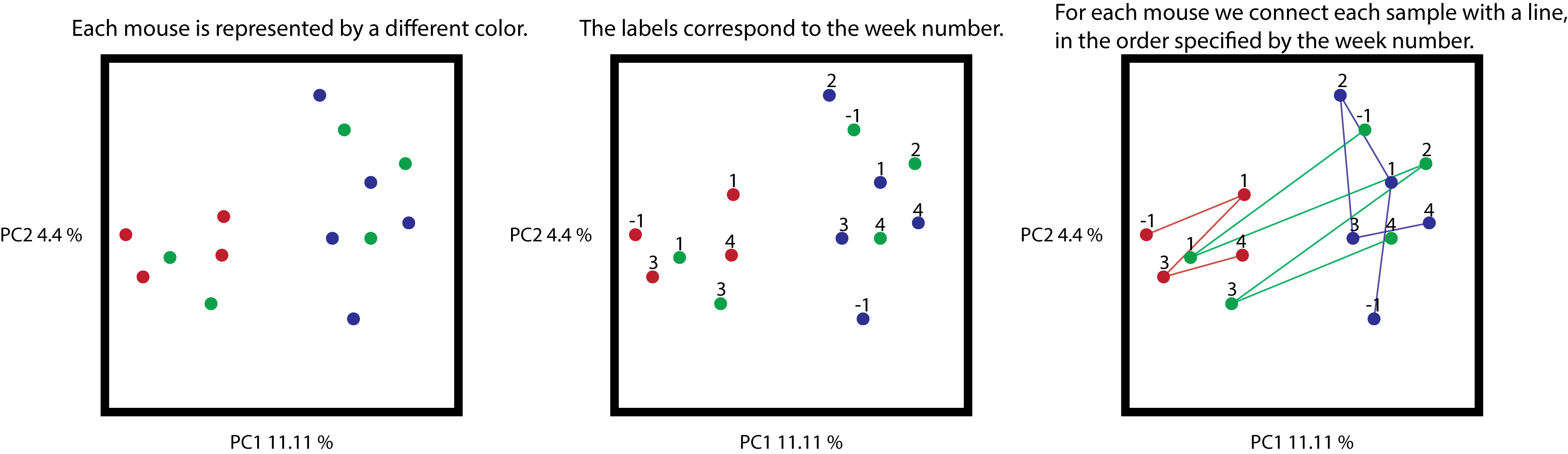
Cartoon representation of the synthetic example. On the left, the unmodified
ordination coloring samples by mice. On the center, the same ordination with
a label for each sample, corresponding to the week where this sample was
collected. On the right, samples connected by a line, where the order is
determined by the collection time (all trajectories begin at -1).
From the trajectories, you can see that samples are connected according to the
numerical order in the gradient category, and that missing data is simply
ignored, for example the red samples are missing timepoint 2, therefore
sample 1 is connected to sample 3.
In the next section we will go through an example using published data from Weingarden et al. 2015.
Real Example
Data
This example will help us visualize the short and long-term changes of four patients as they undergo a fecal material transplant (FMT). To contextualize these changes, we are going to use the data from the Human Microbiome Project (HMP), an initiative that characterized the microbial communities of 252 healthy human adults in four different supersites (fecal, skin, oral and vaginal communities).
For convenience, we combined the two datasets using Qiita. Specifically the studies we used are study 10057 (FMT) and study 1928 (HMP). Remember you need to be logged in to access the studies.
The files needed for this tutorial can be downloaded from this link.
Processing
As discussed before, we will need to identify two columns that allow us to sort samples, and to group them. We only want to focus on the observed changes in the microbiome of patients that undergo an FMT, therefore the subjects from the HMP data won’t need to be animated, and the samples are instead used as a frame of reference.
Notice that in mapping-file.txt there are two columns that describe this
information. First, as the gradient category, we can use
day_relative_to_fmt (a column that describes the number of days before or
after the FMT), and as the trajectory category we can use host_subject_id
(a column with unique identifiers for each individual participating in both
studies).
One thing you will notice is that samples from the HMP lack a value for the
day_relative_to_fmt column, since these subjects did not undergo a
transplant. When we look at these samples, we observe that they are all labeled
with an unknown value. In order to use this information we will replace the
label unknown for a 0, such that the mapping file passes Emperor’s
validations. You can do this using a spreadsheet manipulation program like
Excel, or alternatively you can use a scripting language like R or Python
(using Pandas is recommended) to perform these manipulations. After doing this,
we suggest that you create a new column that includes these modifications, and
name it animations_gradient.
Note
When plots are generated with Emperor, only columns where all values are numeric can be animated as a gradient category. Trajectories with mixed types or with non-numeric types will be ignored.
As for the trajectory category, we will ignore all subjects except the ones
that underwent a FMT, so for all other samples (both for the HMP and FMT), we
will set the host_subject_id value to NA. Again, we will create a new
column to store this modified information, and we will name it
animations_subject.
Note
The names of the columns can be arbitrarly chosen by the user, but we recommend clearly distinguishing the purpose.
After you’ve done this, the result will be a new metadata mapping file that
includes two new columns, animations_gradient and animations_subject
(for an example see mapping-file.animations.txt). All that’s left is to
create the plot itself, to do that we will use qiime emperor plot:
qiime emperor plot --i-pcoa unweighted-unifrac-pcoa.qza --m-metadata-file mapping-file.animations.txt --o-visualization unweighted-unifrac-pcoa.animations.qzv
After you do this, you can open the plot, select body_habitat as a color
category (under the Colors tab). Now, go to the animations tab on the right.
Next, in the Gradient Category menu select animations_gradient, and in the
Trajectory Category menu select animations_subject. Now you can click the
play button and visualize the changes in the microbiome of the four patients.
As you do this, you can continue to interact with the plot, and change other
visual attributes.
The resulting plot can be found here, please note that this plot includes a few presets that will be different from the plot that you generated above, however both plots are fundamentally the same.
Filtering out data
In some situations, we want to focus only one or a handful of the existing
trajectories in a dataset. In such a case, you can hide any trajectories you
want by creating a new column in your sample information, for example
animation_one_trajectory, and then setting the values of the samples that
you do not wish to see animated to 0.
The idea above applies as well to blanks or other types of technical samples that will not need to be animated.